Parallax scrolling is one of the latest buzzwords in web design, but what is it, exactly? In this article, you’ll learn about parallax, its pros and cons, and how you can maximize its potential for your web site.
Parallax refers to the displacement in the apparent position of objects from different viewpoints. It was originally implemented in video game special effects to make background and foreground images move at different speeds, giving the illusion of depth. When used in web design, the concept is similar: different elements scroll up the page at different rates, creating the illusion of depth. Replacing a flat static background with dynamic parallax elements helps to draw users into the page and encourages interaction. The website for the game Firewatch provides an excellent example of this.
How Should I Use Parallax?
Parallax effects offer a whole world of web design possibilities. When incorporating parallax into your website, make sure that it’s serving a specific function. Using it for aesthetics alone can make your website look awesome, but it can do much more. You can use parallax effects to draw users’ attention to certain elements on your page and entice them to take specific actions.
There are many ways you can incorporate parallax into a website. The key to using parallax correctly is not overdoing it. Make sure effects don’t interfere with the user experience, complicate navigation, or require an unnecessary amount of scrolling. When designing with parallax, keep these tips in mind to can impress and engage visitors:
- Use parallax to tell a story and guide visitors through the site.
- Make page visits last longer by encouraging users to scroll through the entire page.
- Lead visitors to key elements such as call-to-action buttons or forms.
Drawbacks
Parallax can enhance the appearance and effectiveness of a website, but there are a couple drawbacks that you should be aware of before using it.
- Parallax sites are often a single long page, which can be make it more difficult for search engines to accurately identify their content. Because each web page can have only one set of meta information and one H1 tag, parts of your content may be overlooked by search engines. Although parallax isn’t generally SEO friendly, however, it can be optimized to be.
- Your site’s load time can take a big hit if you try to include too many elements. The last thing you want is for users to get frustrated waiting for it to load and then leave before getting to see your riveting designs.
- Parallax is better suited for websites that are expected to get more desktop traffic than mobile. A big shortcoming of parallax is that it isn’t very responsive and doesn’t work with mobile browsers.
Examples
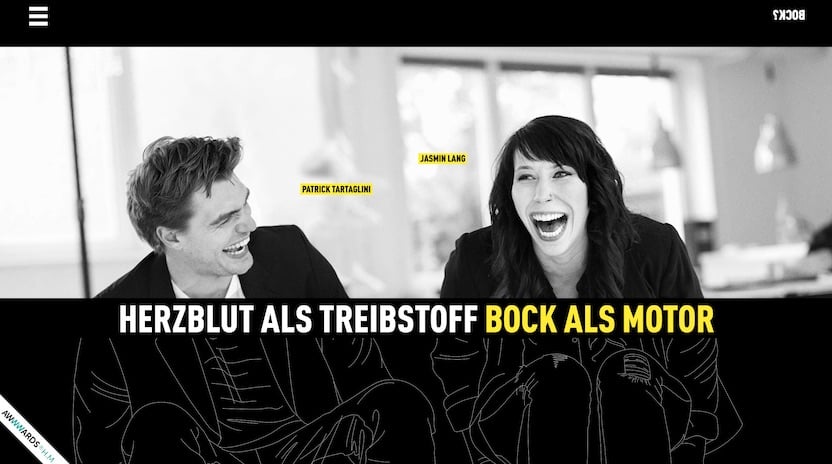
Click on the images below to check out some of these other great examples of parallax web design for inspiration!
1. Wildlife
If you are looking for someone to build your online presence and design a compelling website for you, Blue Frog Dynamic Marketing can help. We have offices in Des Moines, Denver, and Huron, Ohio, assisting clients across the country with website design and web development. Contact us today to learn more.


