The Internet is constantly changing and so are the trends and styles of the websites that fill it. Someone is always coming up with a new idea or web design strategy that works better than what we are currently using. This can make it frustrating and difficult to keep up to date with the best online marketing strategies and designs. As a result, it's important for your business to work alongside a marketing firm that stays at the front of the curve so your business website can too.
Don’t be discouraged if your site is a little out of date. It can happen quickly to any site. All good websites need to be updated and checked regularly. Below are several website design trends that have been popular in the last few years but have proved to be inefficient, out of date, or ineffective. If your site incorporates any of the following elements, it's time to consider an update.
Pop-ups
Pop-ups aren’t all bad. In fact, they can be very helpful if used effectively. If you have a pop-up on your site offering help for the user (something that politely supports your marketing efforts), then more power to you! However, be sure that the wording on your pop-up isn't offensive in any way and that you don’t overexert your marketing efforts. Pop-ups can be very annoying if they get in the user's way. It could make it difficult for them to read or find content on your site. If it's distracting or becomes a hindrance to someone finding what they’re looking for, you should remove it.
Don’t use wording that tries to guilt people into doing something or makes it seem like they’ll miss out if they don’t “click here.” You only want to offer support for visitors and allow them to respond to if they would like, not annoy or offend them by forcing something they don’t want.
Auto-Play Videos
If you have a video on your site, don’t have it set to auto-play. Instead, give visitors the option of pressing play and tuning in or passing by it without having to deal with unwanted interruption. Auto-play videos can push visitors away by annoying them with sound and movement. The same goes for auto-play music; people don't usually respond well to it, either.
Sliders
Slider images on the homepage of your site may look cool and capture a visitor’s attention, but they may actually end up hurting more than helping. If a visitor is sitting on the home page, watching several slider images glide past their eyes, it could be keeping them from traveling to other pages of your site. They’ll be staring at your slideshow when they should be searching your site for what they came for in the first place.
Aside from distracting the visitor, sliders are usually composed of multiple large images that may take time to load. This could cause frustration, particularly to those searching your site from a mobile device, which might take longer to load. You have only seconds to convince your visitor to stay on your page, and if it takes several seconds for the page to load, you may lose a potential customer.
Sliders are by no means ALWAYS bad. If you only have a couple images in your slider, and the images are optimized to load quickly, it could be a great way to capture the visitor's attention and lead them further into your site by offering them what they're looking for right away. Make sure your messages are clear and provide a call to action, if appropriate.
Static Websites
Websites that don’t change (aren't ever updated with new content) will soon be lost and forgotten. It’s important to keep your site updated and dynamic. You should continuously be adding fresh, quality content to your site. This will keep old visitors coming back for more AND will help your site rank higher in Google search results. To learn about the differences between static and dynamic websites, check out our post, "Static vs. Dynamic Website Design."
Separate Mobile Sites
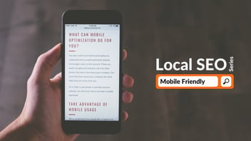
Having two separate websites, one for mobile devices and another for desktop computers, comes with several disadvantages. 1) It can cause confusion for viewers because the mobile version will likely be very different from the desktop version. 2) Google discourages having two separate sites as opposed to one responsive website. Your website ranking on search engine results will go way down if your content is duplicated in multiple locations; this is seen as plagiarism. 3) Google encourages responsive website design and will offer better ranking in search results for sites that are optimized for mobile use. Mobile-friendly sites are now even labeled in Google search results.
If you think your website could do with an update or if you need a new website for your business, contact Blue Frog Marketing. We would love to work with you, no matter your location! We currently have two offices, one in Denver and one in Des Moines, but we work with clients from all over the country. Contact us and let us know how we can help you!
We offer 0% financing for 12 months on ALL new websites! Click on the button to take advantage of this offer today.


