In the last blog, we went over three specific design trends: flat design, skeuomorphism, and responsive design (design for mobile use). Today, I'll talk about a few more trends that are currently flooding the Internet: parallax scrolling, content-focused webpages, fixed navigation, and a few others.
Parallax Scrolling
First off, what exactly does parallax mean? Parallax scrolling creates a feeling of movement and depth on a webpage. The exact definition of parallax is “a displacement or difference in the apparent position of an object viewed along two different lines of sight.” According to Rob Palmer, for “true parallax” to be achieved, two things are required:
1) An object or point of focus
2) This object must have an apparent position in a given space that can be manipulated by movement, giving the viewer a sense of depth perception
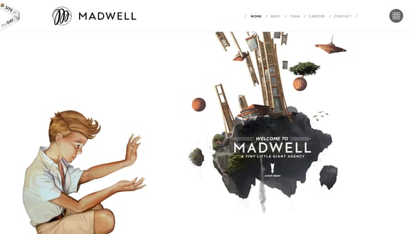
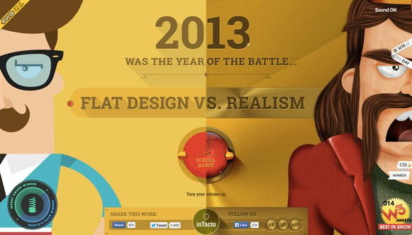
If used correctly, parallax scrolling can create a very artistic and creative look, making websites stand out and successfully grabbing a viewer’s attention. Here are a couple great examples of parallax websites that are on the Internet today. Go check them out!


flatvsrealism.com
A lot of website users, and even some website designers, assume that most long-scrolling sites are parallax sites, when in reality many of them are not. Just keep in mind, for a site to achieve true parallax, it needs a viewer (you!), an object, a background, and some sort of movement. The combination of these four things creates depth and an intriguing experience for visitors.
Simplified, Content-Focused Design
When you come to a website, do you like for the page to be chock full of text, images, and more text, so that you don’t know where to look or find what you were searching for in the first place? A web design trend or style that is becoming increasingly popular is simplicity. Web designers are redesigning webpages to make them easier to navigate with less crowded spacing and a more minimalistic feel. The focus is now on the most important aspects of the company, opposed to stuffing as much content onto one page as possible. With this being said, the content that is provided should give the viewer a very clear and concise idea of who the company is, educating and building trust and relationship with them right off the bat. This has great potential to grab attention and draw viewers into a website from the get-go. Content-heavy websites in particular are beginning to pick up on this trend, stripping down on what, at first, may have seemed overwhelming to viewers.
I could go on for a long time writing about all of the web design trends that are out there right now, but we'll just cover a few more here:
Fixed Navigation or Header Bars: This cuts down on scrolling and keeps the website simpler and quicker to navigate from page to page. This is a particularly good idea to use on long-scrolling sites or on sites with a lot of content on one page.
Leading Visitors to Your CTA: This is always important. The purpose of most websites is to lead the viewer (potential customer) to make a decision, whether that’s purchasing a product or requesting a service.
Infographics Used to Represent Data: Infographics are clear, concise representations of data. If designed well, they should simplify information to make it easy for viewers to comprehend quickly.
The list goes on, but now you have a good idea of what many of the popular trends on the web are right now. It’s good to keep these in mind if you are thinking about having your own website created for your business. If you have questions about website design, graphic design, printing services, marketing, or social media, feel free to give us a call or fill out an online form to request more information about our services. If you are interested in a website for your business, Blue Frog Marketing, located in Des Moines, Iowa, will work with you every step of the way to help you create an interactive extension of your business, helping you grow and more effectively progress toward the success and profit you desire.


