There are many design trends that have become increasingly popular over the last year. These include, but are not limited to, clean, fresh design, simplicity, minimalism, and a focus on designing websites that can be utilized on small screens, such as those of smartphones and tablets.
Flat User Interface Design vs. Skeuomorphism
Designers are moving away from realistic looking elements and designs and moving toward flat user interface design. What exactly is flat design you ask? Flat design is a stripped down, simplified version of realistic looking elements. Gradients are taken out, giving items a flat, less three-dimensional look. Skeuomorphism, which was previously a very popular user interface design, is becoming more and more criticized and less widely used. Skeuomorphism attempts to replicate elements of the natural world so that they mimic the properties and behaviors of physical objects. Apple is a prime example of a company that has used this design style in their use of icons, such as the calendar, address book, etc. Lately, their use of skeuomorphism has been accused by some of being outdated, tacky, and ingenuine. At the same time, Apple has had a lot of success using this technique; their apps are both easy to recognize and user-friendly.
Flat design is becoming an increasingly popular website design trend. One reason for this is that when it comes to responsive web design, building a website based on flat designs is much easier to create than if the site was based on skeuomorphism. Another reason is because of the clean, modern, minimalistic look and feel it offers users. Microsoft and Google’s Android system have picked up on this. With the introduction of Windows 8 we saw a very minimalist, flat design style. Google mobile apps also incorporate very flat design with a touch of skeuomorphism to make certain elements stand out from others. When Apple came out with the iOS 7, everything was a lot flatter than before. Textures were removed and colors were much simpler, with less gradient. Apparently, they got the message to tone it down a little.
Perhaps there is a balance that needs to be found between the two extremes of totally flat design and skeuomorphism. As for right now, we seem to be heading more in the direction of the flat design trend. It will be interesting to see where this heads over the next year or two.
Design for Mobile Use
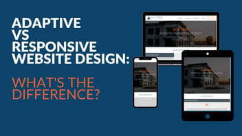
Over the last few years especially, smartphone and tablet usage has exploded. These days, a lot of people simply grab their phone to search for a website. This means it is very important that web designers build their sites to make them “mobile-friendly.” They need to think about designing their sites so they are easy to navigate and information is comprehendible on a smaller scale. Of course, this means that keeping a website simple by taking out extra frivolities and keeping the bare minimum will make the transition from the full website to the mobile much simpler. Businesses that embrace this adaptive and responsive website design trend will keep at the front of the curve.
These are just a few of the many design trends that are flooding the Internet today. They are good to keep in mind when thinking about how you want your own website designed for your business. Your website’s primary function should be to provide easy access to great content for your visitors. Everyone who visits your site could be a potential customer, so providing them with helpful, relevant, and direct information will help them find quick answers to their questions and perhaps convert them into loyal customers. The website designers at Blue Frog Marketing, located in Des Moines, Iowa, will help you create a website that is an interactive extension of your business, helping you grow your business and more effectively progress toward the success and profit you desire.


