Designing the homepage of a website can be tricky. There is a lot to take into consideration when laying out the page, such as deciding what to include and what to leave out or push to a different page of the site. I think it’s safe to say that your homepage is the #1 most important page of your entire website. It’s the face of your site. It gets the most traffic. It’s the first page people see when they visit. It’s oftentimes what determines whether someone stays on your site when visiting for the first time or leaves to never return.
Your website can serve as your best employee, if designed effectively. Throughout this post, I will cover several key components that your business website needs to have on its homepage in order to capture the kind of positive attention and attract the customers you want for your business.
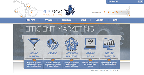
Something that really sets the homepage apart from all of the other pages of a website is that it needs to cater to many different audiences. For instance, Blue Frog’s homepage (see below) clearly displays all of our different services with links for easy navigation, including Inbound Marketing, Printing, Social Media, Graphic Design, and Website Design, as well as our Blog, About Us page, etc.
We know that there is going to be an assortment of people with different needs looking for very different information when coming to our site. That makes the homepage like a road map that needs to help customers reach their intended destinations. It's vital that your homepage is mapped out clearly, with a main navigation bar prominently displayed, clear titles and descriptions of services, and graphics and images working to lead viewers to where they can easily meet their objectives. The other pages of the site are usually broken down, each working toward a more individual goal. For example, if you click on Printing on our homepage, it will lead you to a page that contains information about our printing services only. It is serving a specific customer with a specific need and leading them to where they can take action to accomplish their intended goal.
Here are 8 elements that your homepage must have in order to be as successful as possible. (This list is taken from HubSpot’s “12 Critical Elements” infographic.)
1. Clear Headlines: Visitors should be able to see, almost immediately, what your business has to offer them. With clear headlines that stand out and instantly focus your attention, visitors will quickly know if they have come to the right place or not.
2. Concise Sub-Headlines: Underneath a headline, include a brief description of the service or product you are offering. Make sure you keep it clear and concise so visitors can quickly find what they need. Why does this product or service stand out? What makes it valuable to the customer? These are the kinds of questions you can answer in your sub-headline descriptions.
3. Benefits and Features: Tell customers why they have come to the right place by including the benefits of your services on your homepage. Also include some of your key features.
4. Easy Navigation: As already mentioned above, your navigation should be easy to spot and provide direction to the other pages of your site. Don’t make the navigation too complex. Keep it simple and visible in the same place on every page of the site so that visitors can move around quickly and efficiently from page to page.
5. Calls-to-Action: In order to generate leads on your homepage, it is very important to include both primary and secondary calls-to-action (CTA). Include 1-3 primary CTA on your homepage where they are easy to spot. Secondary CTA can also be included towards the bottom of your homepage so that no matter where visitors are while scrolling through the page, they have the opportunity to take action. You could also include a CTA that offers a valuable resource for customers, such as an ebook or special offer.
6. Proof of Success: To prove that your products or services actually work, display some kind of proof (customer testimonials, awards, or other recognition you have received).
7. Images that Support Content: Make sure that your site is not entirely text-based. Most people are very visual, so you need to be sure to include images as well. Make sure your images are original, support your content, and reflect your brand and identity.
8. Overall, Avoid Clutter: Don’t include too much content on the homepage. Keep things simple and straightforward enough so that viewers won’t get lost or confused. Leave some white space. You don’t want to fill every inch of the screen with content and overwhelm the viewer. Leaving some white space will make things easier to find and, overall, make the user experience better.
That may seem like a lot of information, and it is! There’s a lot to include to make your homepage successful and generate leads the way it should. If you need a website redesign or want a new website created for your business, contact Blue Frog Marketing. We are a Des Moines based firm and would love to get you going on your website design project today!


