The landing page is one of the most important elements of a successful marketing strategy. It is the portal through which a visitor to your website becomes a lead, and it’s one of the best tools to use to analyze the success of your marketing efforts.
So, how do you optimize landing page design?
With attention to these five key components of landing page design, you’ll ensure that your landing pages are fully optimized to capture new leads.
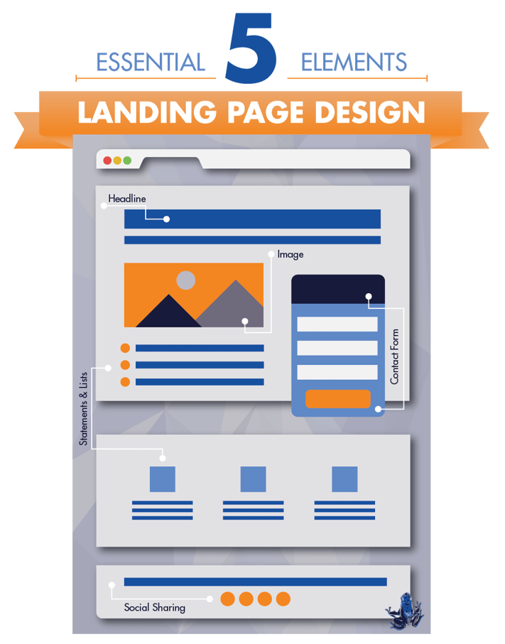
1. Headlines Sell.
It almost goes without saying that a headline is the first thing your readers will see. It’s your best shot at grabbing their attention, so make it count. Using a descriptive, concise, and clear headline that tells your visitors exactly what you’re offering will ensure that your landing page won’t mislead or confuse readers.
2. State Your Case.
This is your chance to convince visitors that they need what you’re offering. Getting someone to fork over their personal email, phone number, or other individual details is a lot more difficult than most people realize. Remember to highlight the benefits of what you’re offering, not specific features or details. Landing pages are great places for bulleted lists, which can get your point across quickly to time-pressed readers.
3. Include a Visual Cue
Alongside your headline, an image is the next visual cue that your reader will see, and it is a critical element of an effective marketing strategy. Our brains are naturally wired to take in information visually, so include a relevant picture that clearly illustrates your offer. For example, an eBook or guide should include an image that represents the type of information your visitors can expect to receive.
4. Convert with a Form
While headlines, descriptions, and images are major players in the anatomy of your landing page, a contact form is the real MVP. Without a form, visitors have no way to leave their contact information behind, so it’s absolutely vital that your landing page include a well-designed and easy-to-follow form. Tailor your forms to each offer, and include relevant information like email addresses, phone numbers, age ranges, or the type of products or services they’d like to learn more about. Making your contact forms as specific as possible without overwhelming visitors with questions will help them feel accurately represented and help you to tailor your offers and communications to their specific needs.
5. Share Your Stuff
Each of your landing pages should have social sharing options to help spread the word about your offer. Give your visitors the opportunity to do some of your advertising for you, and reach an entirely new audience in the process. In the world of social media, there’s no such thing as too much opportunity to share, and that’s a trend your business should capitalize on.
Think you’re up to the task of making a high-converting landing page? We hope so! If you’d like to talk to any of our inbound marketing-certified employees here at Blue Frog, we’re here to help. Give us a call at 515.221.2214, visit our Des Moines or Denver office, or find us at www.bluefrogdm.com to talk to us about your landing pages and other web design needs.
