When visiting a Page on Facebook, one of the first things you see is the cover photo. It’s crucial to use a cover photo that makes a strong first impression of your Facebook Business Page when people see it.
Optimize your photo for desktop and mobile.

One of the biggest issues with cover photos is that Facebook's desktop and mobile interface have different cover dimensions. This is important to take into consideration when designing so you can successfully create a cover that stands out to users on Facebook Business Pages.
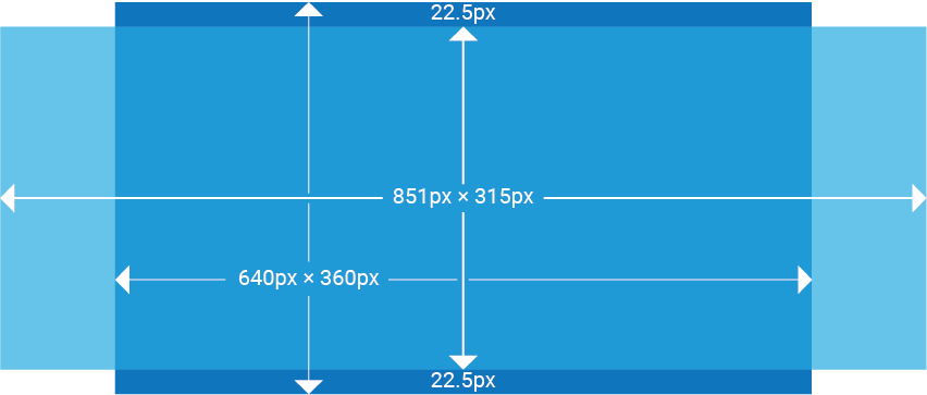
When you upload a cover photo that isn’t optimized for both screens, you risk Facebook automatically resizing your image resulting in an awkwardly cropped cover photo. For desktop your photo dimensions are 851 x 315 px, and on mobile they display at 640 x 360 px. This 45-pixel height difference and nearly 25% reduction in width can cause Facebook to crop your cover photo to fit mobile dimensions. Important elements like text and logos can be lost due to this auto-correction.
To prevent this, give elements a 150-pixel margin on the right and left of your cover photo and a 50-pixel margin on the top and bottom. This ensures your elements won’t get cut off and gives them breathing space from the edge of your cover.
Make your photo stand out.
Now you know how to optimize your cover photo, but how do you find the right image? Here are some important considerations to make when designing your cover.
-
Does your image connect with your brand?
-
Is it overcrowded with text or other images?
-
Is your image engaging to your target audience?
Having an image that adheres to the rest of your branding is key so it can create consistency for the user as they view your posts and other media. Curating your social media and website to have the same look and feel will give users a sense of familiarity.
It’s good to take advantage of your cover photo to promote messages, but it’s important to keep your cover balanced. Too much text or too many graphic elements can crowd a photo, and text can get lost in an overly busy photo. Letting your designs breathe allows users to get the most out of the message you are sending.
It’s important to choose images that capture viewers’ attention. Photos that show emotion, are relevant, and have colors that pop generally do well with viewers. Using creative typography and hashtags can also help encourage users to interact with your posts.
Engage viewers by using cover videos

It can be difficult to adequately express your brand and your company culture in a photo. Thankfully,
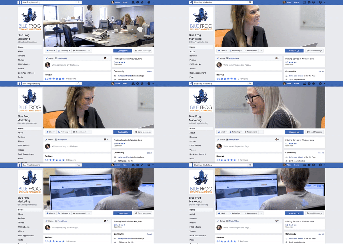
Facebook offers cover videos that autoplay (without sound) when a user visits your Page. This allows you to provide content that immediately captures viewers’ attention and keeps them on your Page longer. This engagement with users provides you with more opportunities to spread messages and share brand-related content from the moment they visit your Page.
Don’t have time to craft the perfect social media posts?
Blue Frog Dynamic Marketing can help develop and adapt a
social media marketing strategy for your business.
Contact us today to learn how you can put our team of graphic designers, website designers, social media marketers, and content creators to work for your brand.


