A variety of tools and resources are available to assist with building a website, making it seem ideal to save the money and do everything with out a professional. While DIY websites seem more cost effective up front, detrimental mistakes made during the design and development process could hurt your business in the long run. Below are several DIY mistakes that could prevent the success of your website.
1. Forgetting an SEO Strategy
While search engine optimization (SEO) is a high priority for most professional web designers, it can often be overlooked on a DIY website. According to Moz, “Search engine optimization (SEO) is the practice of increasing the quantity and quality of traffic to your website through organic search engine results.” In other words, it’s important to build a website with certain SEO techniques in order to be found on search engines like Google. Some of these techniques might include
- Featuring concise and engaging content
- Utilizing hierarchy and headings or sub headings
- Understanding key words and phrases and where to place them
- Incorporating meta descriptions
- Using design elements and images that are relevant and eye-catching
2. A non-Responsive Design
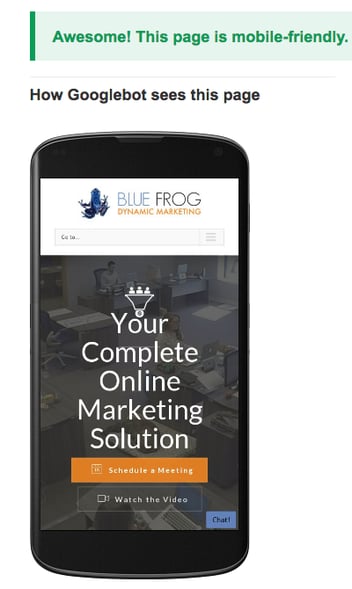
Responsive design requires building a website in a way that allows it to adapt to multiple screen sizes. According to smart insights, Americans spend approximately 71% of their online time via a mobile device. If you’re website isn’t compatible with multiple screen sizes, you could be deterring mobile users and missing out on a lot of potential business. In addition, a responsive design provides a better user experience and can also improve SEO. To learn more, check out our article, “Benefits of Responsive Design.”
3. Poor Site Structure
When you’re working on a DIY website, it’s likely that you are writing, designing, building, and who knows what else for the site. This can make it difficult to take the time to evaluate the organization of the site and how it could be causing a poor user experience. It’s crucial for users to see and understand the purpose of the site and how they can easily access the information they seek. If your site is disorganized, it can confuse users and also make it difficult for search engines to index your website’s information and allow it to appear in search results.
4. Neglecting the Content and Blog
Producing great content and blogging regularly is often a miss on DIY websites due to lack of resources and planning. Fresh and relevant content is not only good for SEO; it also shows your authority and expertise in the industry. Your site content should incorporate keywords and phrases, clear headings and subheadings, and meta descriptions to be optimized for search engines. In addition, blogging regularly can help build relationships with potential customers and boost your social media engagement when you share your posts on those platforms—bonus!
5. A Cluttered Homepage
Most DIY websites are built not only on a small budget but also in a shorter timeframe. This can make it more tempting to just throw all of the content into one place (most likely the homepage.) This might seem effective in order to meet a deadline, but it can seem busy and confusing to visitors. Your homepage is often your first interaction with new customers, and it should accurately represent your organization and professionalism. Ideas to consider for reducing clutter on your homepage include
- Creating a sitemap that helps organize and disperse content to the most logical areas of the site.
- Prioritizing information by asking yourself, “What do I want a visitor to do on the site?”
- Reviewing content for any duplicative or unnecessary verbiage to keep things concise and valuable to the user.
- Analyzing the success of certain links or clicks to establish how users are navigating the site.
6. Bad Design Choices
When it comes to website designs, appearance matters. Professional designers are up to date with the latest design trends and also know what design strategies will improve the user experience. Some platforms allow non-designers to manipulate pre-created templates, but there are still many limitations that won’t allow the site to reach its full potential. A good website design should include
- A simple and logical layout
- Authentic and relevant imagery
- Eye-catching and intentional color choices
- A clear call to action
Investing in a great website design should pay for itself. By avoiding mistakes like these, you can improve engagement with potential customers and trust that your time and efforts will pay off.
If you have questions about website design and development, content creation, or SEO strategy, contact Blue Frog Marketing. We are a full-service marketing agency based in Des Moines with additional offices in Denver and Huron. Contact us to schedule a consultation and improve your online marketing presence today!


