It takes about 50 milliseconds (that’s 0.05 seconds) for visitors to form an opinion about your website. Your website is one of the most important tools for a successful online marketing campaign, so it’s important to determine which aspects of it are working and which aren’t. If your website isn’t converting visitors into leads, how do you figure out what you’re doing wrong and how to fix it? Here are five questions to ask yourself during the website review process and how to fix what might be going wrong.
What Are You Showing Above the Fold?
To most website design companies, “the fold” is dead. Due to multiple screen sizes, the fold is an ambiguous marker that visitors often scroll past once the page loads. But for each visit on every size screen, there is an area that is seen first. One study shows that eight years ago, 80% of visitors spent their viewing time above the fold. Today, readers still spend the majority of their time there, but 81% of the total viewing time is spent in the first three screenfuls of information. This means people will scroll farther down a screen if they are given a reason to do so—and today’s users are more encouraged than ever to keep scrolling.
Here are some tips for a successful first impression above the fold.
Make Your Value Proposition the First Thing Visitors See
If a visitor can’t tell what your business is all about within those first 0.05 seconds, you’re likely to lose them. Use the 10-foot rule: if a viewer can’t understand what your business sells while looking at the website from 10 feet away, you should reposition your value proposition.

Unbounce’s proposition statement is clear from the moment you visit the site.
Avoid Carousels
A sliding image is distracting, and most visitors won’t stick around to view every slide. Just look at the slider click-through rates from a study of Notre Dame University websites: a mere 1.07% of visitors clicked on a feature on the slider.
Avoid Cheesy Stock Images
If they don’t feel genuine, they won’t build trust. If you have to use stock images on your website, use ones that feel natural and match the design of your site. A good designer can spend upwards of three hours finding the perfect photo, so don’t be afraid to spend some time searching for the best images for your campaign.
What Is Your Website Content Telling Visitors?
The content on your website should be approachable, friendly, authoritative, and to the point. As a general rule, paragraphs should be no longer than 3–4 lines to make the content easier to consume. You should also create your content at an eighth-grade reading level. Although using big words may establish your knowledge on a subject, most readers appreciate simple and easy-to-read content. It makes your business seem friendly and approachable, which is always a plus when drawing in new leads.
Is Your Website Easy to Navigate?
Consumers follow a process called the buyer’s journey, which describes a buyer’s path to purchasing a product. Understanding the buyer’s journey has helped designers organize websites in ways that move visitors through the decision-making process and on to making a purchase. To do this, designers have to be conscious of how a visitor is likely to navigate the website.
Avoid generic navigation titles like “Products,” or “Services.” Descriptive navigation is good for SEO, sets you apart from the crowd, and allows your visitors to know where to go at a glance. If you were to go to a website looking for airplanes, you would want a menu item to be “Airplanes,” not “Products.” Being descriptive tells the user where to go and lends further credibility to your value proposition.

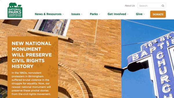
The National Parks Conservation Association website uses navigation titles that are descriptive rather than generic.
In addition to being descriptive, limit the number of menu items in your navigation. Not only is this good for SEO, but it also helps visitors remember you better. Short-term memory only holds about seven items, plus or minus two, so keep your main navigation items to fewer than seven. Your website designers will thank you, since this also makes the header on your website less crowded.
Are You Giving Your Visitors the Opportunity to Convert?
Conversion rate is a good metric for judging how well your website is performing. Chat options, contact forms, and calls to action will help your visitors follow the buyer’s journey and convert into leads.
Keep reading to learn some tips for increasing your website’s conversion rate.
Have a Chat Option
Some users aren’t ready to commit to a product or service even after navigating through your website. Phone calls are too personal, and emailing can be time consuming. Chat options ensure users will receive instant answers to their questions and let them know that your business is available anytime.
Use Contact Forms
Much like chat options, contact forms allow users to have conversations without calling or emailing a business. Having a contact form also allows you to track conversions and collect data on your users, which provides useful analytics for your marketing campaign. Keep in mind that a contact form shouldn’t ask for too much information. Too many fields tend to make users want to click away and look elsewhere.
Strategically Place Your Calls-to-Action
It’s easy to get caught up in the fast pace of the modern world, but asking your visitors to commit to something too soon is a good way to lose potential business. Follow the buyer’s journey throughout a webpage, and ask yourself when a buyer would have the information necessary to be ready to purchase from your business. It may be after they read information about a specific product or service, watch a testimonial video, or read your “About” page. Each website is unique. Take a good look at your industry, buyer personas, and website content to determine the best placement for calls to action (CTAs).
Look at Your Links
Don’t let your visitors hit a dead end on your site. Keep them moving throughout your website by adding internal links and calls to action that lead to other areas of your site. Using internal linking also helps your SEO and passes authority from one page to another. If the goal is to convert a visitor into a lead, make sure you aren’t linking them to pages that are less focused on lead generation, and instead lead them throughout the buyer’s journey as best you can. For example, placing a “Sign up for our newsletter” CTA on a thank-you page can be an effective way to follow up with a new lead and maintain contact until they reach a buying decision. On the other hand, placing a link to a page that simply describes a particular service within a blog post about a specific aspect of that service is less likely to move a visitor along the path to purchase.
Is Your Website Frustrating to Visit?
It’s never fun to search for a product, find a website that matches exactly what you’re looking for, and then have to wait two minutes for the webpage to load. According to Adobe, slow loading times for images cause 39% of users to stop engagement with a website. More than that, Google will use your load speed as a factor in determining your ranking. If your server takes more than two seconds to respond, Google will reduce the number of crawlers to your site.
Speaking of Google, in 2018 they released a new mobile-friendly ranking algorithm. Because of this, mobile websites are now more important than ever. According to Website Hosting Rating, 48.2% of all online traffic comes from mobile and tablet devices, and in 2019, the average adult is expected to spend 3 hours and 35 minutes on mobile devices. This may be a huge cause for concern if your website doesn’t look good on a standard mobile phone.
The success of your website relies on helping visitors find what they need. Paying special attention to the buyer’s journey and asking yourself these key questions along the way will help your website become the lead-generating tool it’s meant to be.
If you’re looking for help with your website, contact the Blue Frog team for a free consultation!


